Creative Direction
Bethany Hamilton - Visual Identity
A complete rebrand for a multi-generational lifestyle brand - translating a comprehensive brand strategy into a unified visual identity, website system, and sponsorship deck.
Bethany Hamilton
Remote
2025

THE CHALLENGE
Build a digital experience that felt as strong and grounded as the person behind it.
Bethany’s brand already had trust, recognition, and a powerful story. One of the biggest shifts was moving the visual narrative away from a more youthful, playful feel and into something more grounded, expansive, and emotionally mature.
I wanted the identity and website to hold two truths at once: Bethany is strong, but she is also deeply reassuring. Her brand not only inspires through achievement. It also connects through calm, grace, faith, and encouragement. That is why this direction became less about performance and more about presence.
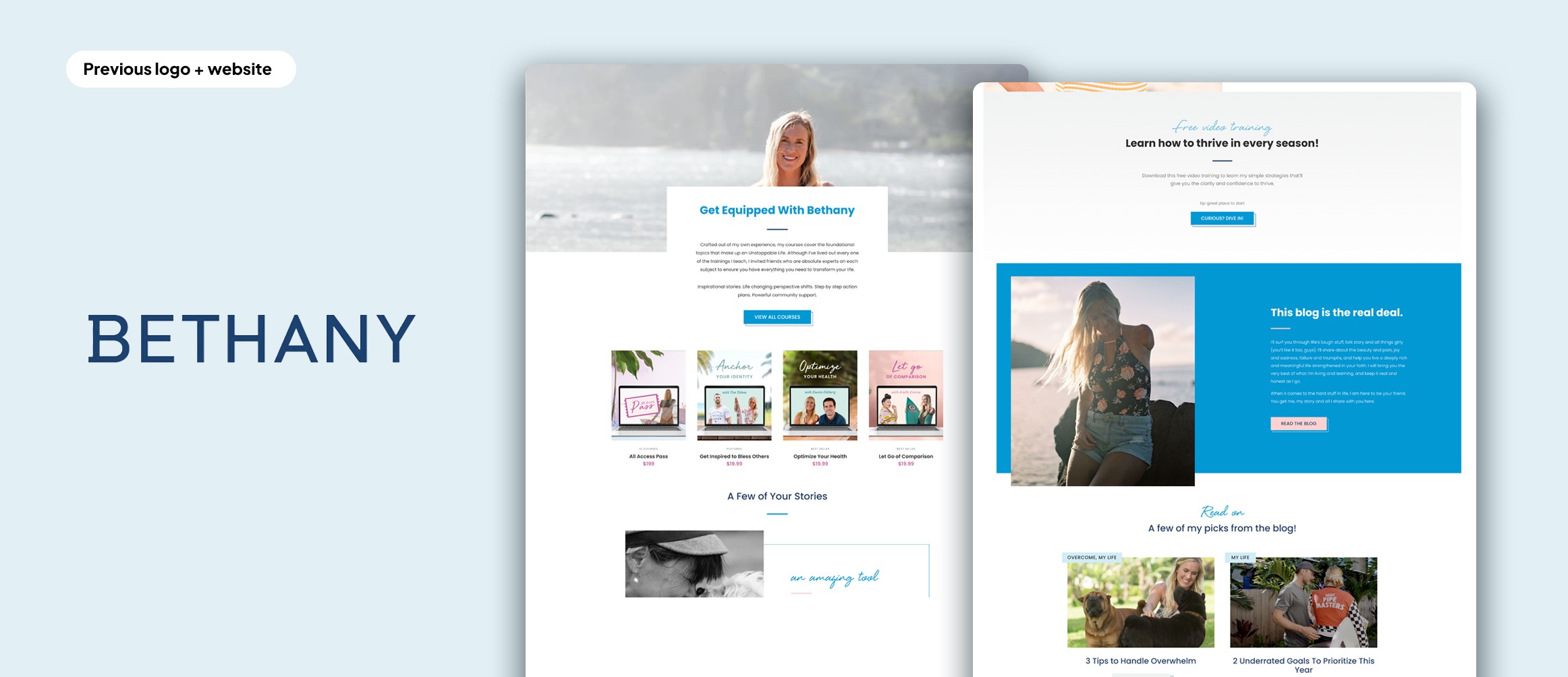
Bethany is strong — but she is also deeply reassuring. The brand needed to hold both truths simultaneously.
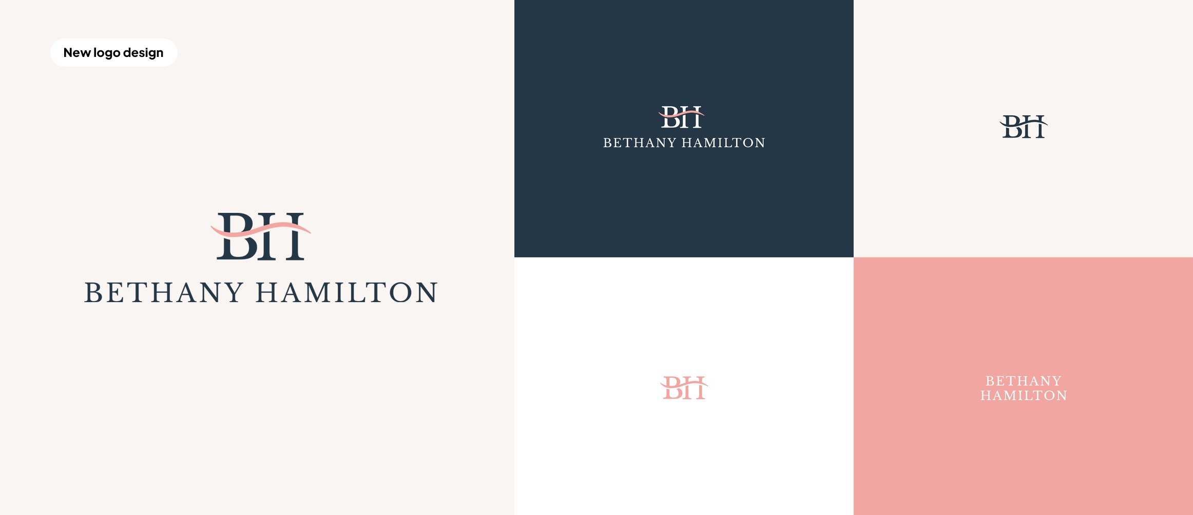
LOGO DESIGN
A mark that could carry more than a surf reference
What I wanted this option to do was hold two truths at the same time: Bethany is strong, but she is also deeply reassuring. Her brand does not only inspire through achievement. It also connects through calm, grace, and the sense that hardship can be carried with faith. That is why this direction became less about performance and more about presence.
The wave symbol between her name was designed to act as more than a direct surf reference. I saw it as a connective form: something that could represent movement, continuity, and trust. Placing it between Bethany and Hamilton helped it function almost like a bridge inside her identity: between strength and softness, between her past and where the brand is growing, and between the public figure people already know and the more personal, faith-centered voice the brand is becoming.
DESIGN THINKING
How I translated the direction into design decisions
These were the core principles shaping the identity and website work.
From inspiration to orientation
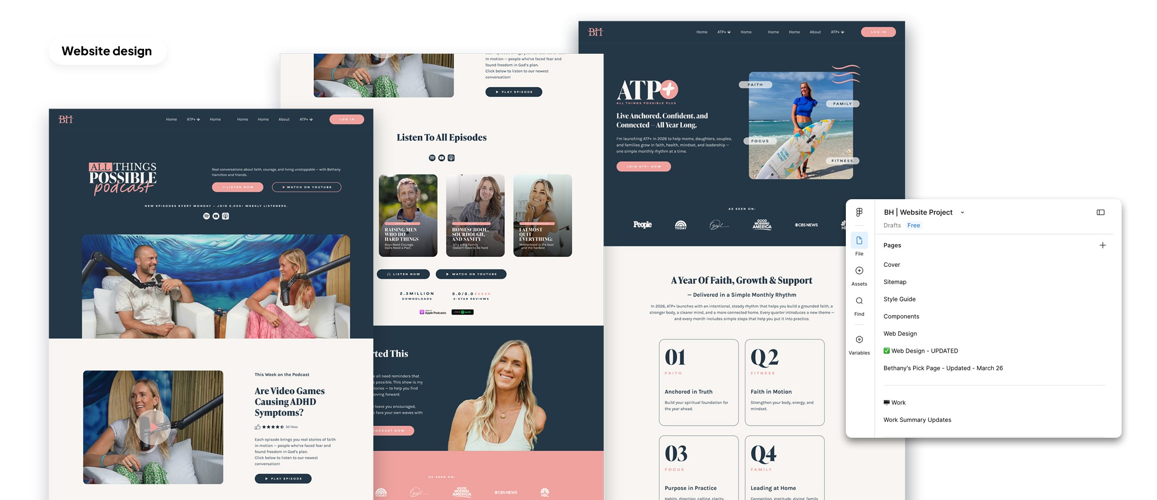
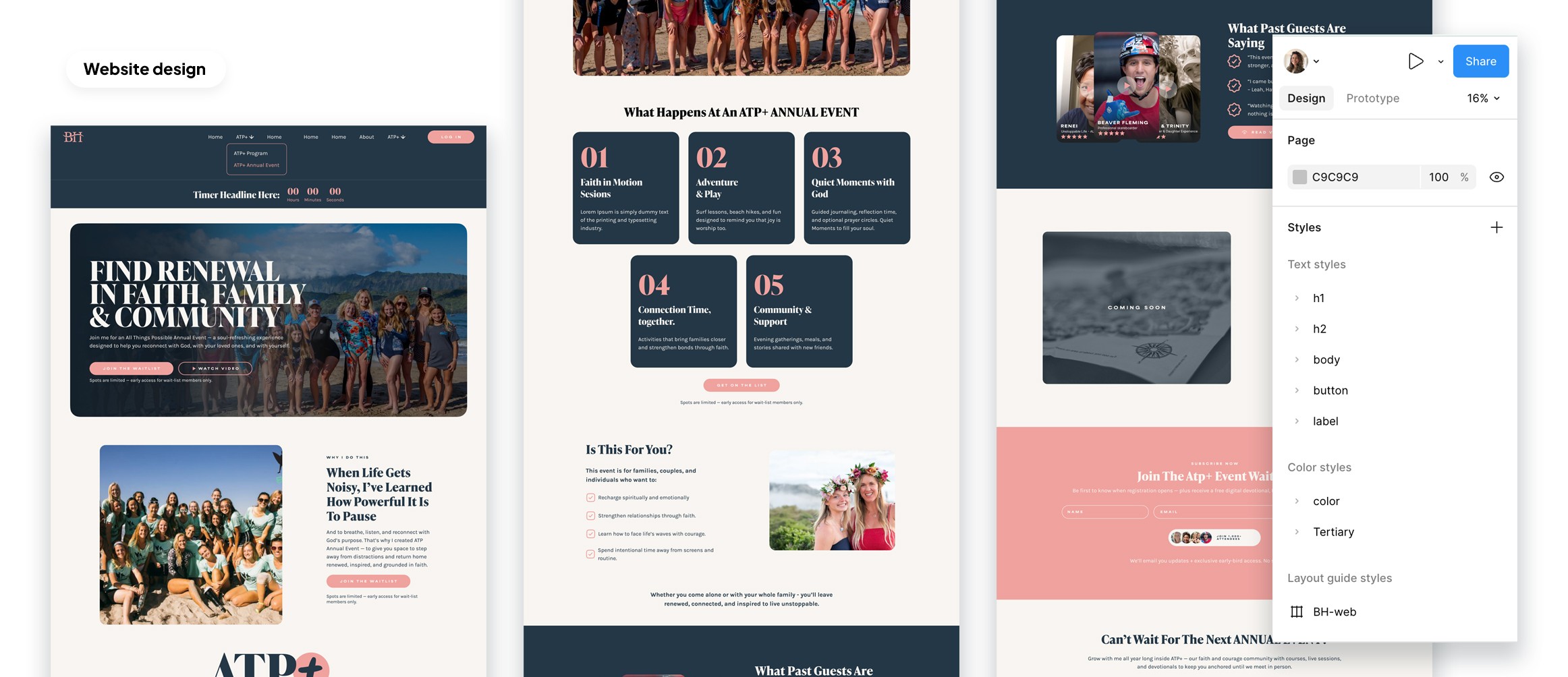
The site needed to do more than feel inspiring. It had to quickly show visitors where to start and what Bethany offered.
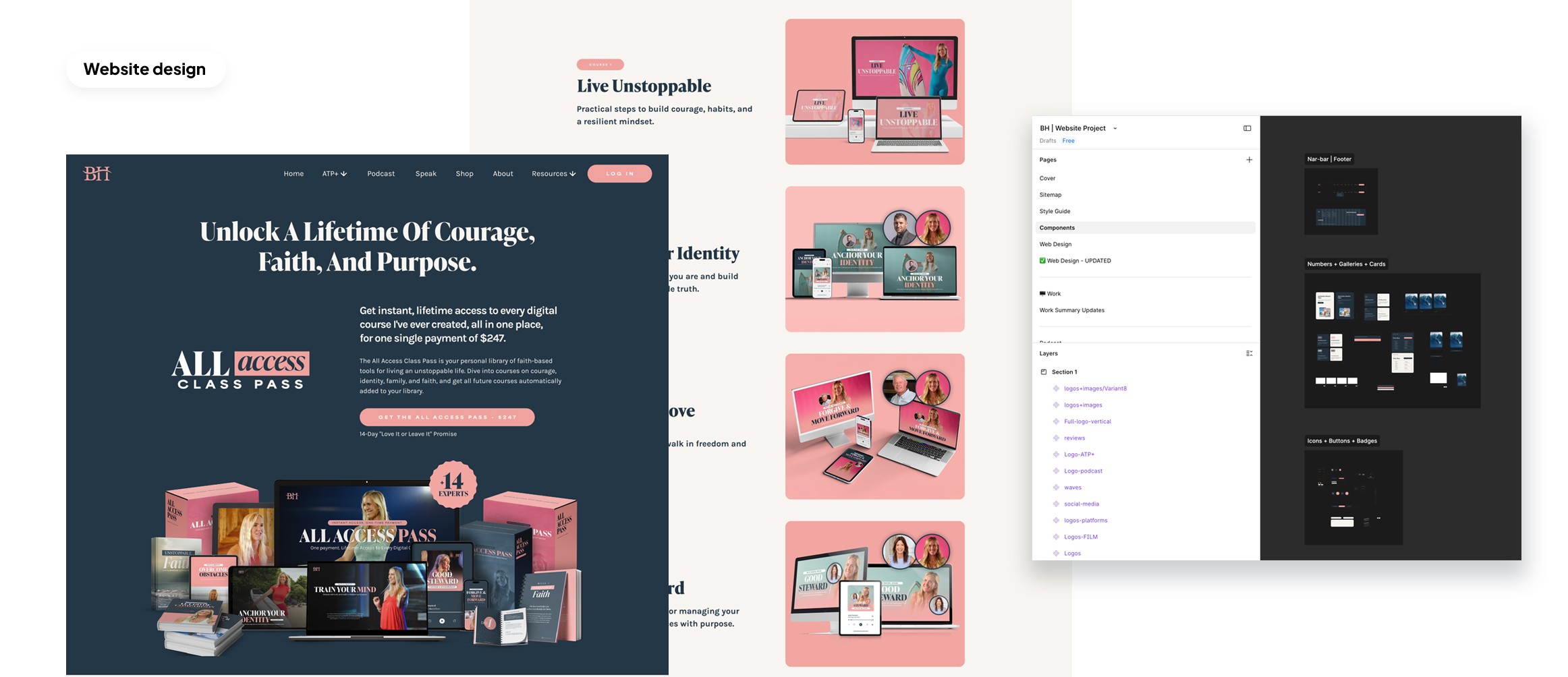
Design that could hold a bigger brand system
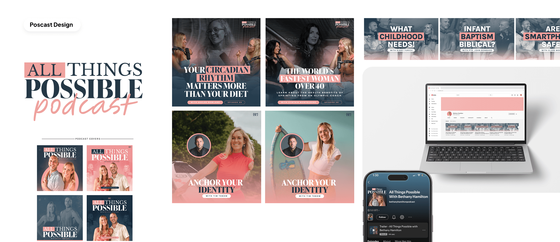
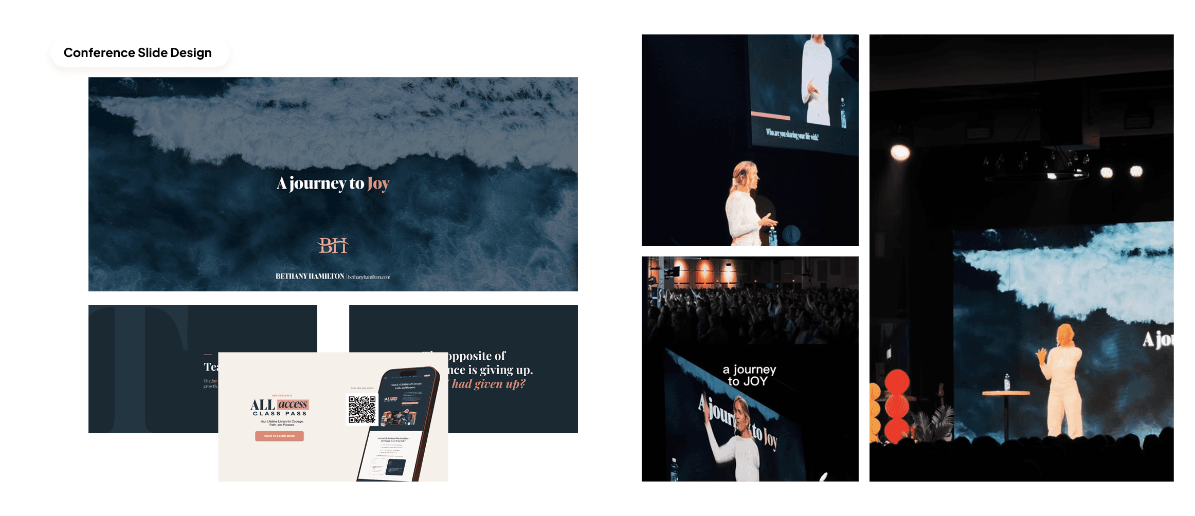
The visual language needed to feel grounded, ocean-connected, strong, and warm enough to work across the website, deck, podcast touchpoints, and future brand extensions.
A more intentional offer hierarchy
Instead of treating the website like a flat collection of pages, I helped shape it into a clearer ecosystem with stronger navigation and more visible entry points into key offers.
User-first copy and page structure
My copy drafts and layouts were built to reduce friction with cleaner headlines, clearer calls to action, and page structures that guided the user.
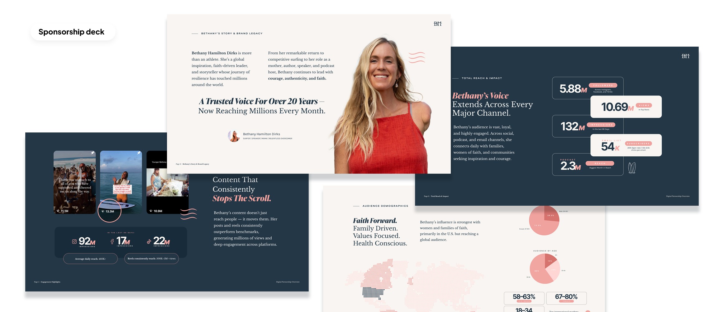
To structure the project, I combined brand and conversion thinking. Donald Miller's StoryBrand book helped me keep the communication audience-centered and clear. Conversion Rate Academy influenced how I thought about hierarchy, flow, and digital usability. Alex Hormozi’s offer framework helped me think more sharply about value, clarity, and how the brand system should support a stronger offer ecosystem across the website, podcast, and partnership materials. Together, these frameworks helped me design a visual identity that was not only more cohesive, but also more purposeful in how it communicated and converted.
www.bethanyhamilton.com
Recent Works
Check our new projects

