Personal Project
Brand & Visual Identity for a Female Band
Building a narrative-led identity for Colombia’s first all-female plancha band
Female Band
Bogotá, Colombia
2026

Project Summary
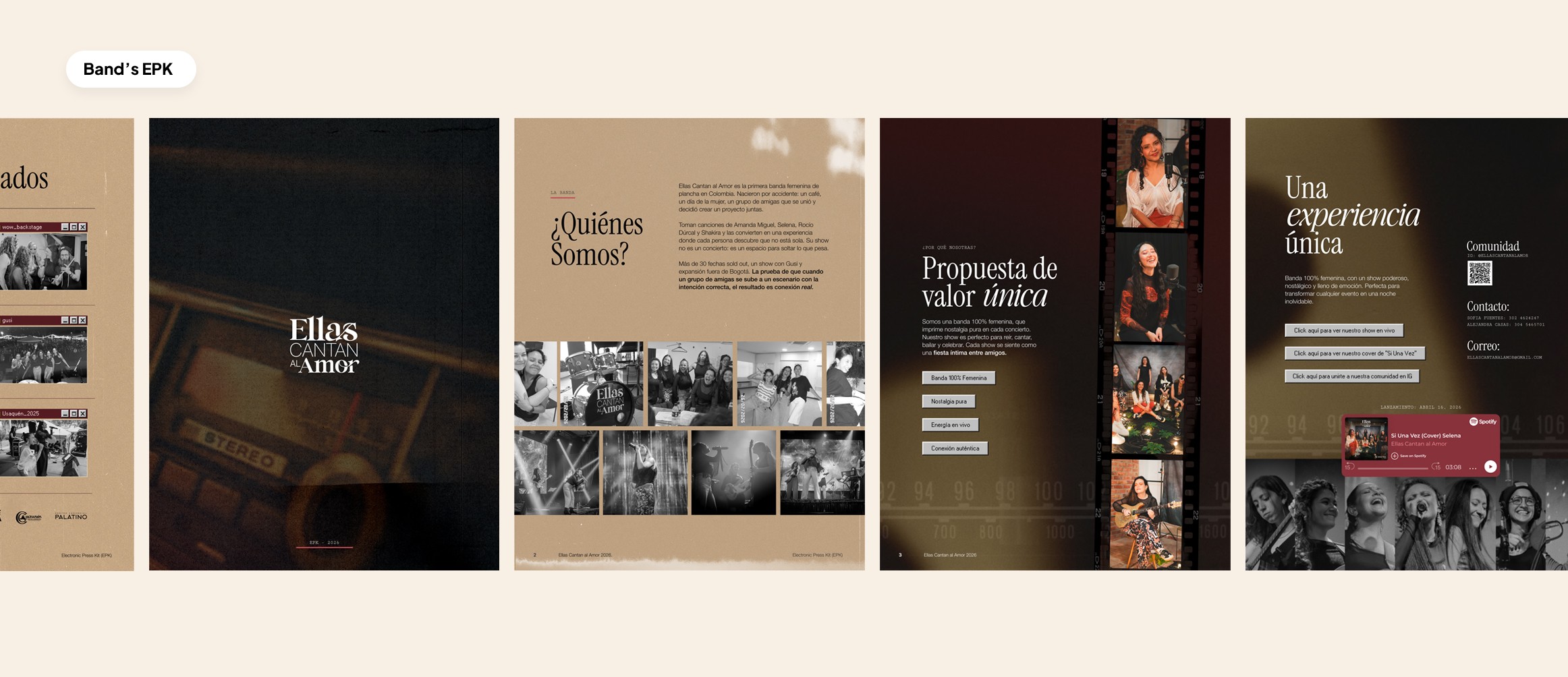
Ellas Cantan al Amor is a Bogotá-based music project that reinterprets iconic Latin love and heartbreak songs as a collective emotional experience. The goal was to create a brand that felt nostalgic, feminine, emotionally rich, and commercially strong, while clearly moving away from the generic, overly sexualized, or chaotic visual language often associated with the genre.
The Challenge
The identity needed to do more than look retro. It had to position the band as a distinctive cultural project rooted in female friendship, emotional release, and live connection, while still being flexible enough to work across social media, live-show materials, and commercial brand assets.
My Role
I developed the brand strategy and translated it into the final visual identity system, including the narrative foundation, symbolic direction, visual language, and the design principles that shaped the brand across touchpoints.
Strategic Foundation
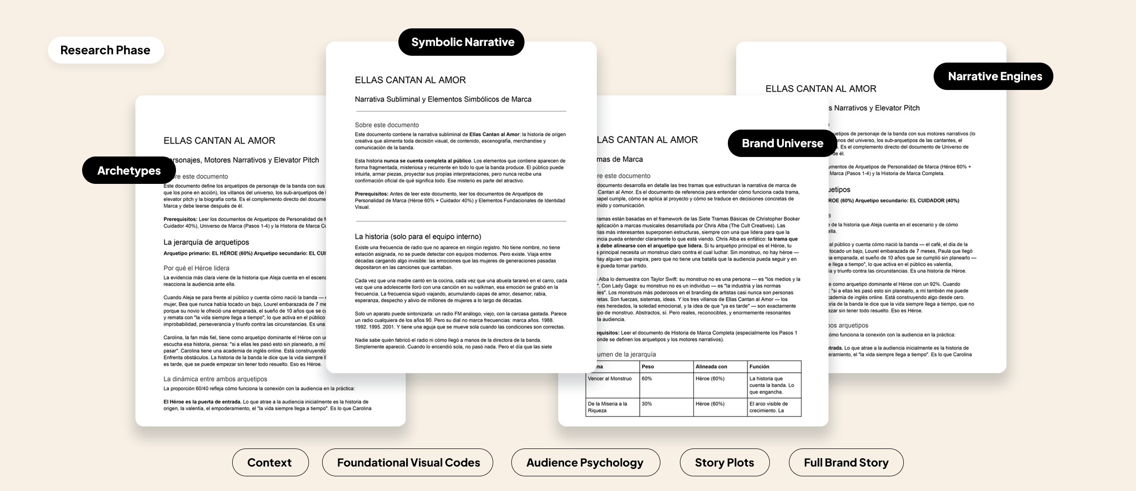
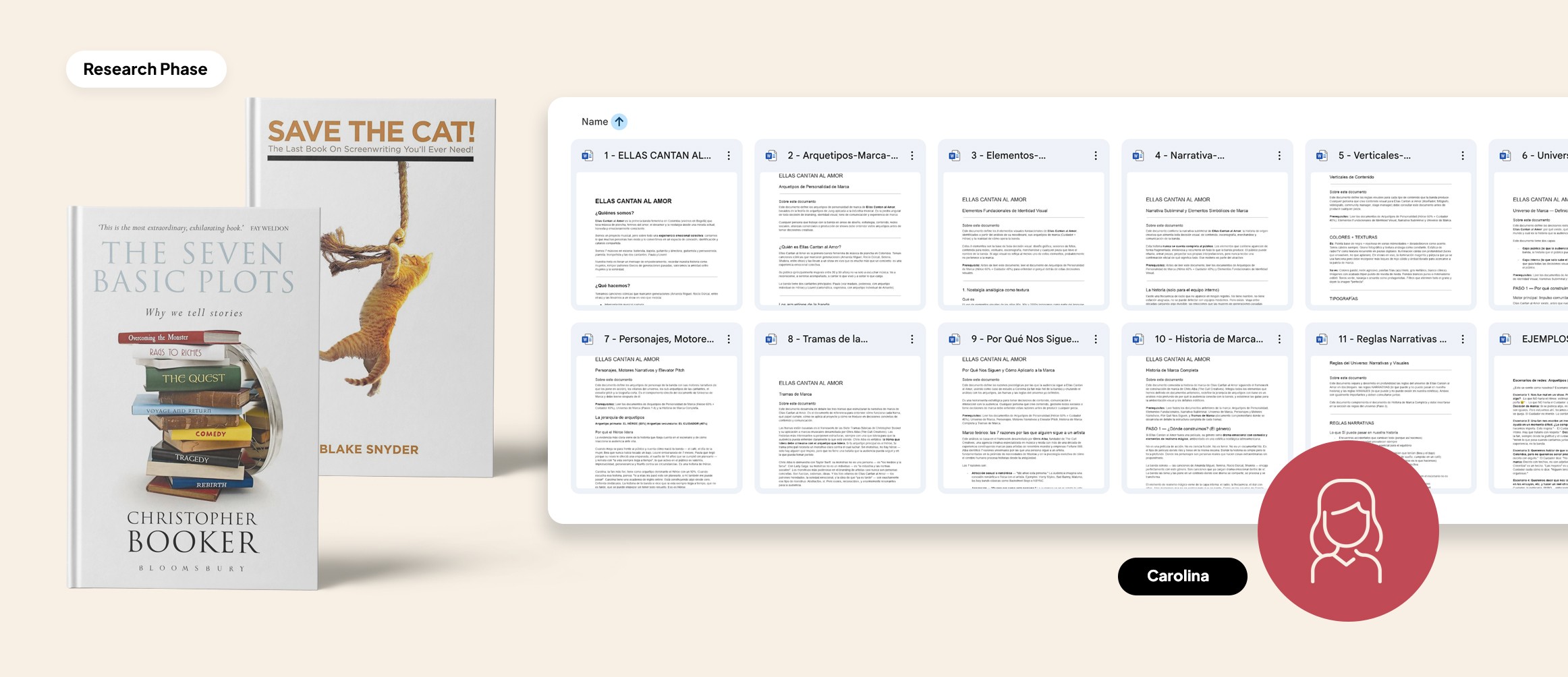
I did not begin this project with aesthetics. I started by building the strategic foundation of the brand.
First, I defined what the band is, who it is for, and what it is not. That meant mapping the audience, the emotional arc of the live experience, the role nostalgia plays in the project, and the positioning boundaries that would keep the brand from feeling vulgar, overly sexualized, generic, or driven by bar-party clichés.
From there, I used archetypal thinking to shape the brand personality. I defined the project as a mix of Hero and Caregiver, which helped frame the band as both emotionally powerful and deeply connective. That balance became important because the brand was not just about performance. It was about creating a shared emotional experience for the audience.
I also built a deeper symbolic system around ideas like analog radio, year dials, static, and frequency waves. This gave the project an internal creative logic that could guide later visual decisions and make the identity feel more cohesive and layered over time.
The result of this phase was a brand with clear emotional logic, narrative architecture, and strategic intention before any visual development began.
Design Development
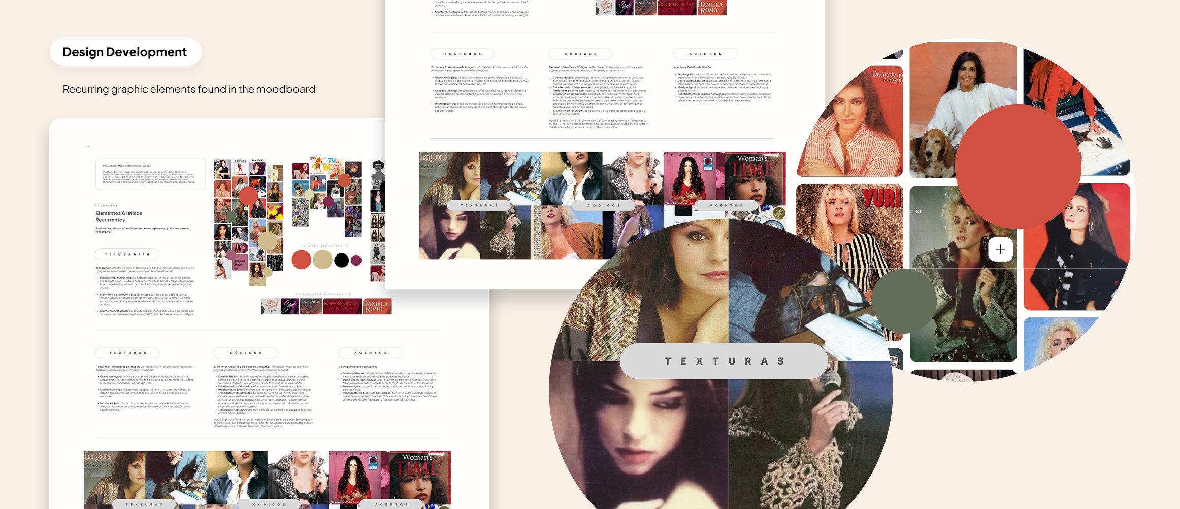
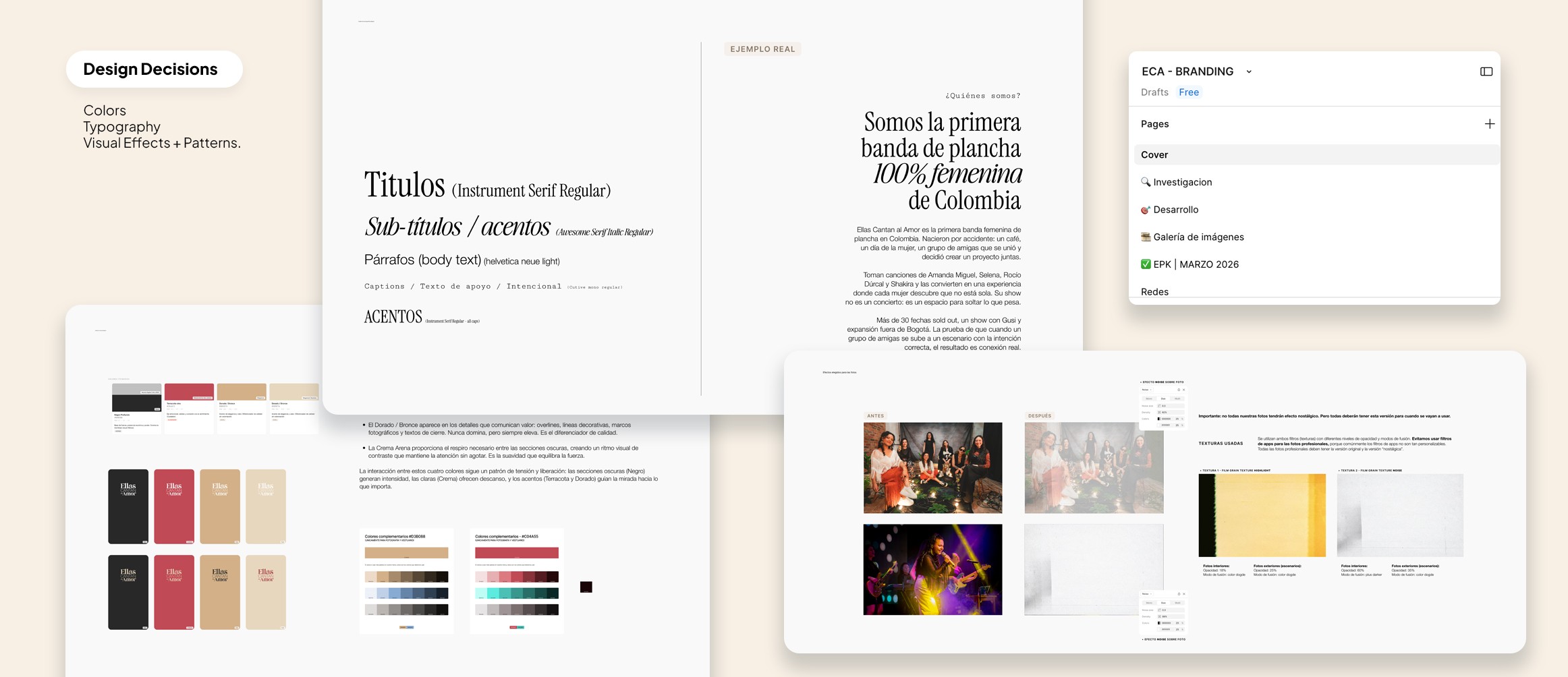
Once the strategy was clear, I moved into visual development by identifying recurring cultural and aesthetic codes and translating them into a focused design system.
I explored typography, color, texture, symbolism, and composition through the lens of the strategy, not just through moodboards or visual taste. This helped the identity feel intentional from the inside out. The design was not built to imitate a retro aesthetic. It was built to express a specific emotional world.
From Strategy to Final Identity
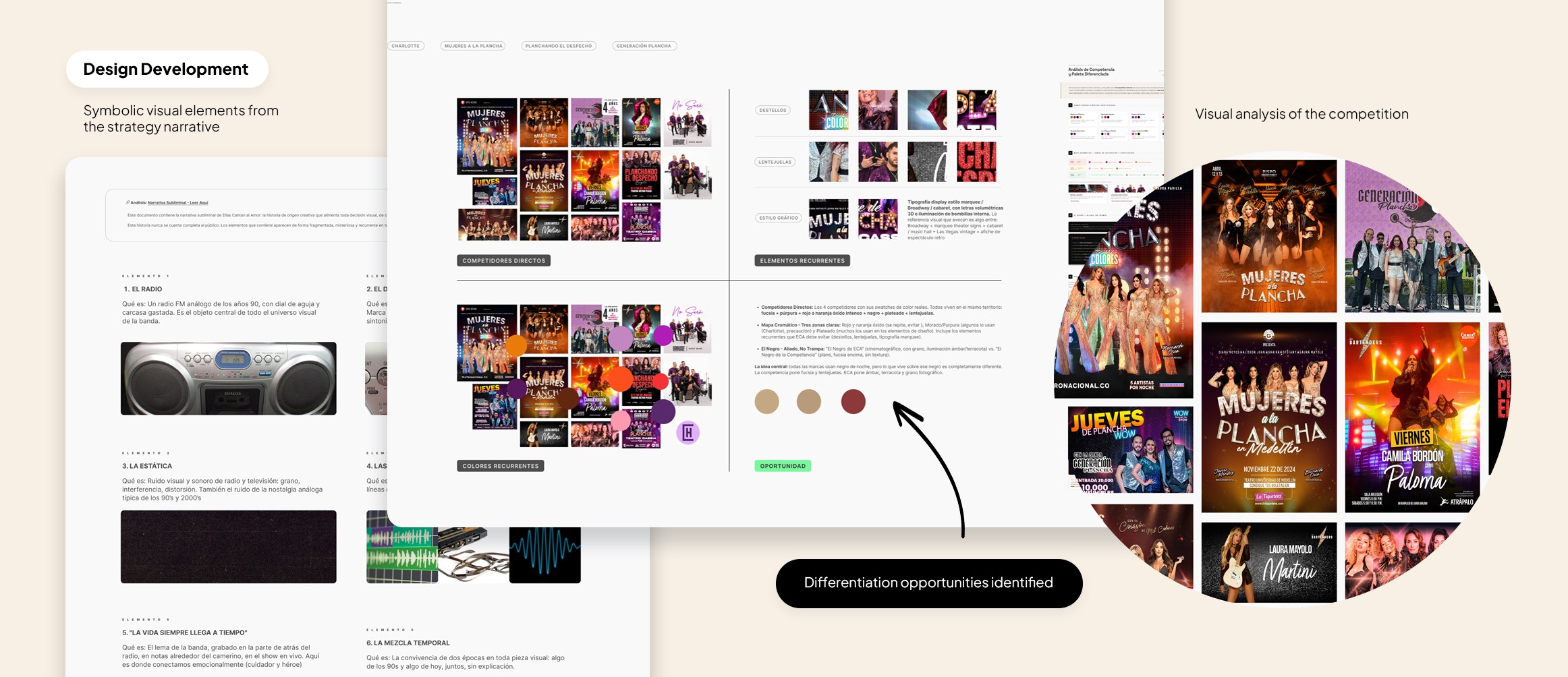
The final identity came from aligning two layers of work: the internal strategy and the external visual landscape of the category.
The strategy phase gave me the emotional foundation of the brand, which led to early decisions around tone, symbolism, color direction, and visual behavior. I then tested those instincts against a broader visual analysis of the category by looking at competitors, recurring palettes, typography, styling, and visual patterns to understand both what felt aligned and where the band could stand apart.
One of the most valuable discoveries in this process was that the elements that emerged most naturally from the strategy were also the ones that created the strongest differentiation. In other words, the same choices that made the brand feel more true to itself also made it more distinct in a category where many projects were beginning to look visually similar.
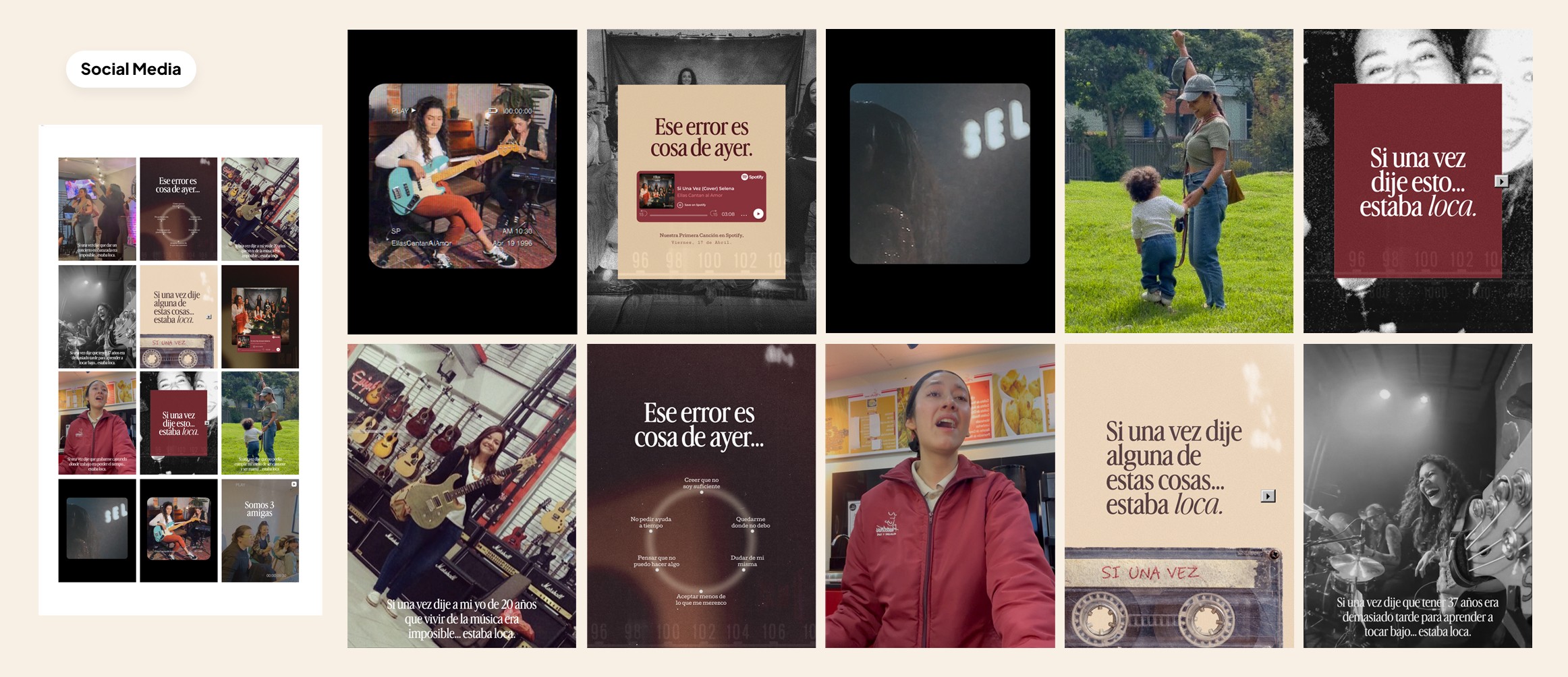
Because the band performs songs from earlier decades, I needed a visual bridge between past and present without making the project feel like a costume version of the 80s or 90s. That is why I brought in references from the 90s digital era, using them as a visual language rather than a gimmick. This helped connect nostalgia with a more current, intentional, and emotionally intelligent identity.
The final graphic system draws from the symbolic narrative built during strategy, allowing the identity to do more than look distinctive. It becomes part of a deeper brand story that strengthens the messaging and gives the entire system more meaning and cohesion.
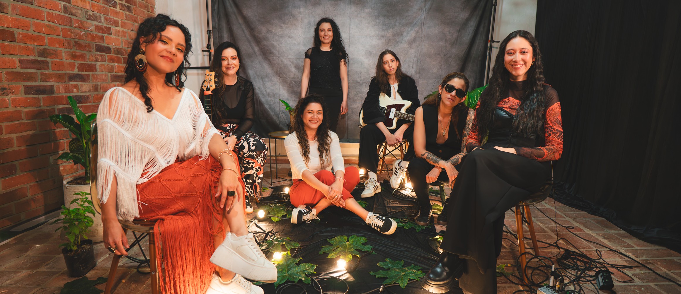
Yes, that’s me - I play the bass too!

Recent Works
Check our new projects

